



In my day-to-day work as a film poster designer, I’m usually focused on solving specific problems, making decisions, meeting deadlines. There’s rarely time to step back and look at the bigger picture.
Since joining Substack, I’ve felt drawn to the philosophy behind NonDē filmmaking. Working independently gives us room to do things differently, the freedom (or is it the necessity?) for solutions outside established systems. As a designer, I try to bring the same mindset to my work. Just as filmmakers don’t need to follow the models of big studios, I don’t necessarily need to run a large design agency to do good work.
Ted had points out in his TakeOver recommendations that readers of Hope For Film are looking for ideas dealing with their life in cinema and how to improve it. This gives me a chance to try and do just that: look back at my experience, think about recurring challenges and share a few practical lessons that might help filmmakers get more out of working with designers.
The goal isn’t to make filmmakers more dependent on designers, but to help them use design as a tool that gives them more control over how their films are presented. But let’s get specific.
Here are five ways to get the most out of working with a film poster designer.
1
Don’t Try to Show Everything
A film is the result of so much work, involving so many people over such a long time. When the time comes to create a single image which represents it, there’s a temptation to try to do too much.
This is where some basic principles of design can easily get lost. There’s a tendency to include too many elements of the story. Maximalism can sometimes be the right solution, but what usually makes a design effective is choosing, simplifying, and sticking with those decisions.
I imagine it’s a bit like the filmmakers’ editing process, where you start with hours of footage, but bravely cut most of it out to end up with a clear narrative and an effective story.
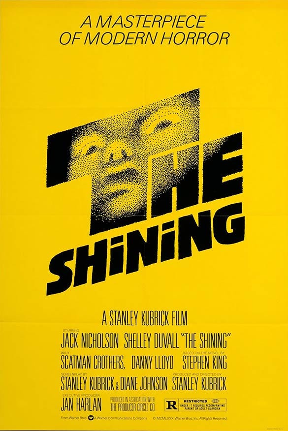
If your designer is developing multiple proposals for the poster, each concept will show a different aspect of your film. Resist the urge to keep adding elements, or, even worse, combine multiple concepts into one. It will only dilute the message, which is not a good path to being memorable.
There’s always the option of making a second poster, using a concept which brings something new to your communication. Naturally, those two posters benefit from having some visual connection (usually through the title design). You could use one during the festival run and the other for theatrical release. This also means more content for your social media.
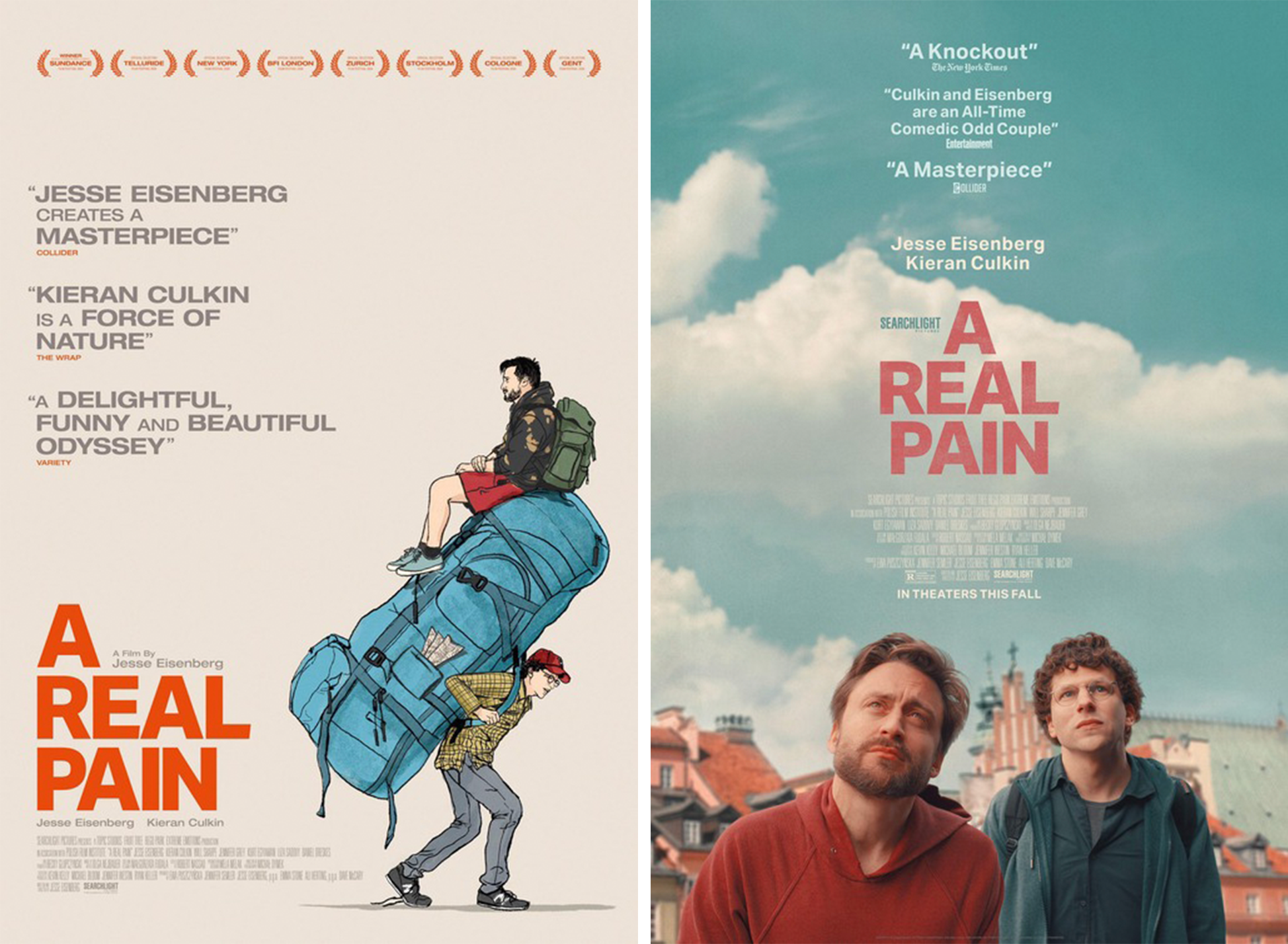
Filmmakers often want to showcase their talented, hardworking cast, but sometimes the poster design doesn’t accommodate that. This is where character posters can be a good solution. Depending on your budget, available assets and the style you’re going for, they can be either illustrated or photographic. Again, it’s something which gives you extra content for your social media activity.
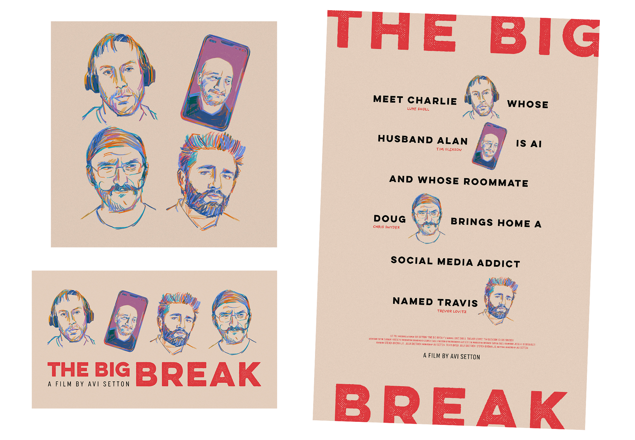
Sometimes things align so well that one design works twice as hard. When designing the poster for The Big Break, a feature film by Avi Setton, we went with an unusual concept: a sentence as the central visual element, decorated with portraits of the four characters. This allowed us to easily generate custom artwork for each character, which Avi and his marketing team are now using in creative ways. You can see some of this in his recent article.
2
Think Beyond the Poster
You’re not McDonalds or Nike, but you can learn from big brands on how to present your product to an audience. In that sense, start thinking of brand touch-points, which is a fancy term for every point of contact (planned or unplanned) between your film and the audience.
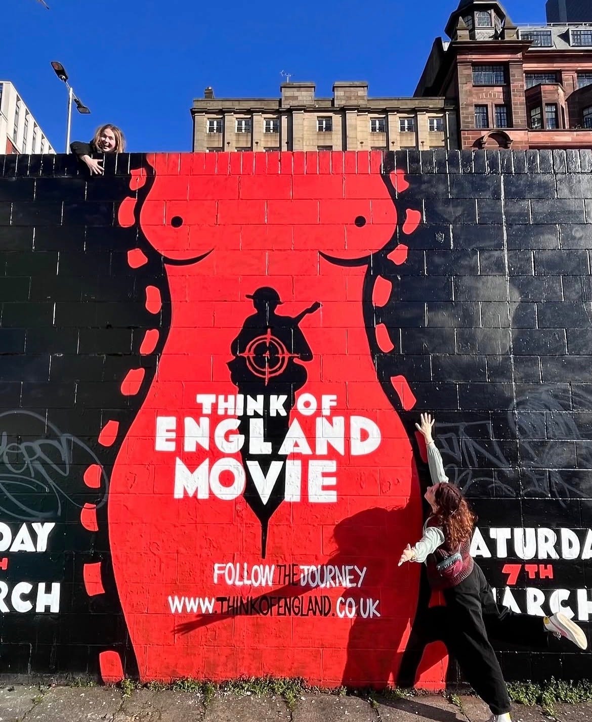
In other words, you shouldn’t just produce a poster and call it done. There’s so many ways people can stumble upon your film, either by scrolling, or by walking in the physical world (I’m a huge lover of posters on streets!) and if you start thinking about this only after the poster is done, you’ll have to improvise and waste many opportunities along the way.
In an ideal world, you would send your designer a long checklist of assets he needs to produce and everyone would be happy. But if your budget cannot afford a whole branding package, give your designer a sense of what you plan to do so he makes the key art with that in mind. Having a specific shade of orange and recognizable typography in all your marketing materials can do wonders for audience perception. The more unique it is, the easier will be to own it.
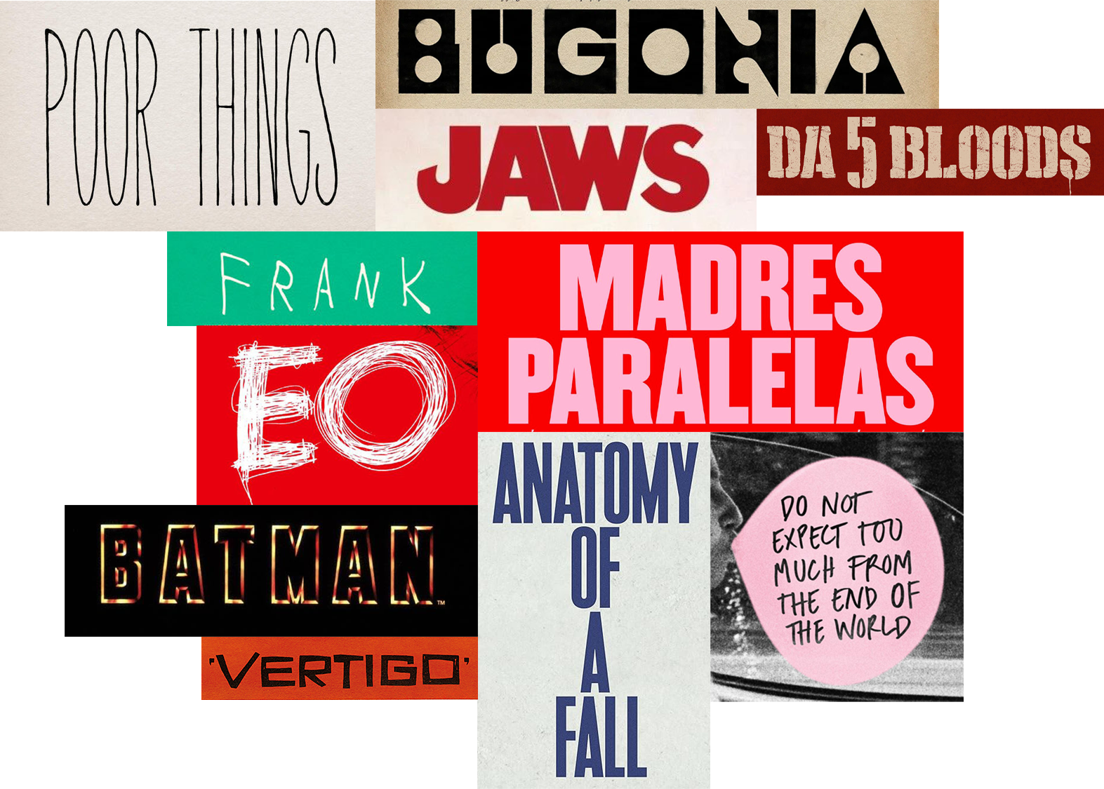
If you need a press kit and decide to make it yourself, there are two easy wins which can help tie your document with the poster.
The first one is typography. Ask your designer to send you the poster title design as a transparent PNG file and place it on your cover. Then, use the poster typeface throughout the press kit layout for all the titles (body copy needs to be readable so use any neutral typeface). Just have in mind that for certain typefaces you will need to own the license yourself.
The second easy win is your colour palette, which just means using colours from the poster throughout the document. For extra points, add background textures to your slides if your poster uses them.
Think of these as your basic brand elements. Applying them consistently to all your offline and online materials will help you build recognition in your marketing.
3
Don’t Lock In the Concept Too Early
Approaching a designer with a very specific poster concept in mind can lead to a good collaboration and a strong result. But sometimes it can also make things harder.
Problems arise when the designer is expected to skip the concept phase and go straight to bringing the client’s idea to life. The design goes through several rounds of feedback and revisions and at some point the client realizes this doesn’t work as well as they had imagined. Things go back to the drawing board and new concepts are needed. Time has been lost, and there’s an added sense of frustration in having to abandon work that has already been developed.
With words, at least there’s some room for interpretation. These days, clients can use ChatGPT to visualize an idea and send to the designer as a reference. Even though it’s meant to be helpful, it’s not a good starting point for a creative collaboration.
Specific references and ideas can be helpful, but the trick is to leave enough room to be surprised. Often, that’s where the best solutions are hiding. Also, designers love to solve problems and they need to bring something of their own to the process.
It all comes down to trusting the person you hired.
4
Start Thinking About the Poster Early
The materials available to a designer (or what we call assets) play a big part in any design project. What you have to work with strongly determines both the process and the final result (that’s also why I try not to judge a poster without knowing the circumstances in which it was made).
Most often, filmmakers get in touch with me when they’re close to a final cut of their film. That’s when they start thinking about the design and marketing. It’s quite understandable, but by then, some of the options may be off the table.
When it comes to poster design, there are two main approaches: photography and illustration.
When making a photographic poster, one option is to use screen grabs. That can work for certain approaches, but having a unit photographer on set can make a real difference. They can capture high-quality images of the cast, locations and various props that are important to the story. These can later be used not just for making a poster, but also for the press kit, social media and other promotional materials. That’s why it’s worth talking with to your designer even before production so you can discuss what kind of images might be useful later.
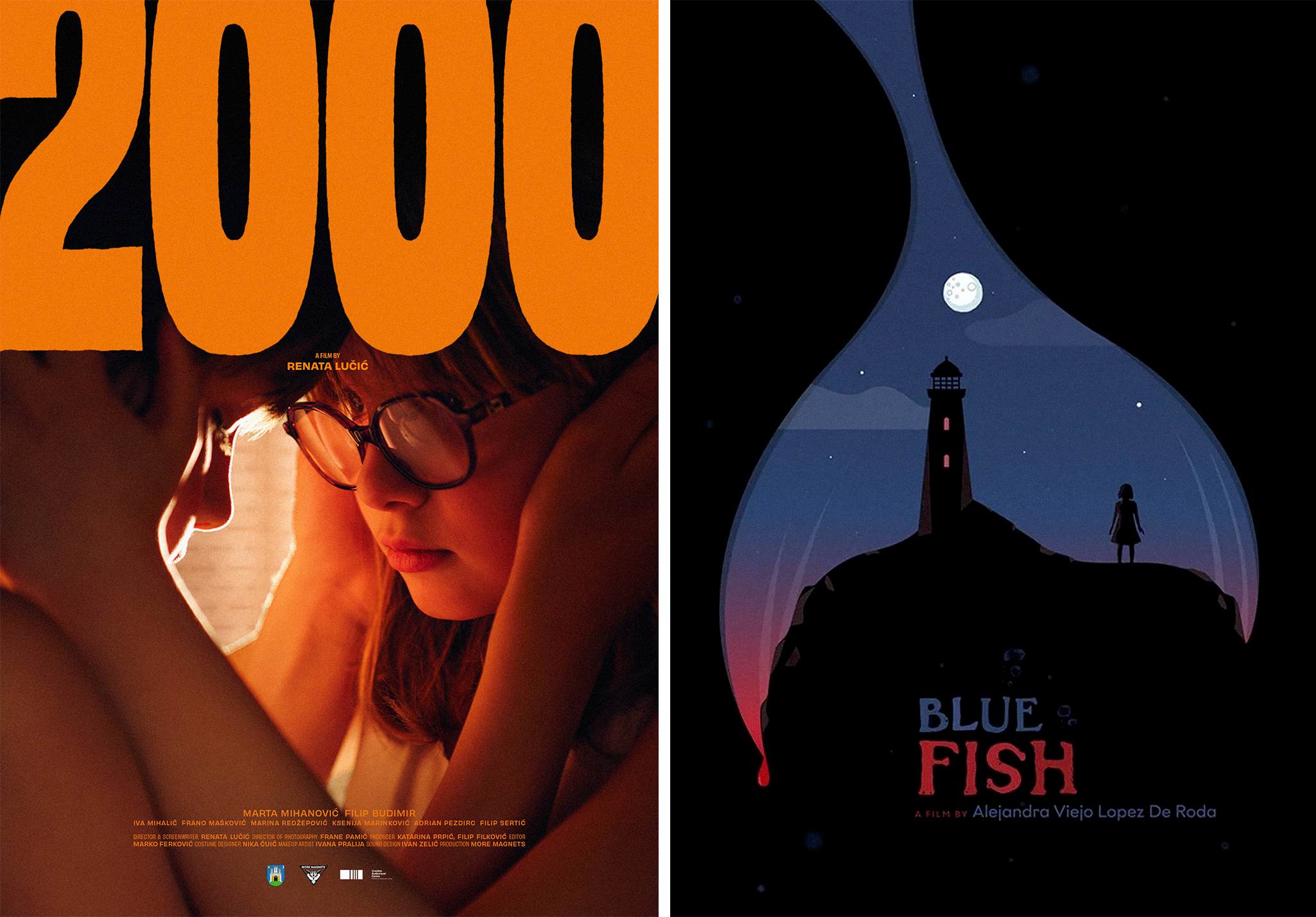
Illustration, on the other hand, offers another way forward, especially when suitable photographic material isn’t available. If your designer offers those services, they can develop a concept based on the script, a logline, the film’s themes or other visual references. Since illustrated posters can be created as early as the development stage, they can become part of the materials used to pitch the project to potential financiers.
Whichever route you choose, remember that it’s never too early to contact a poster designer.
5
Make a Future-proof Design
Imagine this: you have a one-sheet which makes everyone on the team happy. The design is just what you imagined. It looks great on the IMDb, gets a lot of love on Instagram, and you also have a PDF ready for print.
But soon, you need a bunch of new assets to promote your film. There’s the Instagram Story which is much more vertical than your one sheet, and if you just stretch the image, important things get cut off. Posts are now using a 5:4 ratio, which doesn’t really align with the poster either. Perhaps a square version would be nice. A horizontal quad poster. Then the streaming thumbnail which is 16:9, as are Vimeo and YouTube images. Maybe you even decide to create a Facebook page that could benefit from a good-looking header.
The list of formats keeps growing. But the designer’s involvement has ended, so you’re left improvising and juggling all of this alongside your other work.
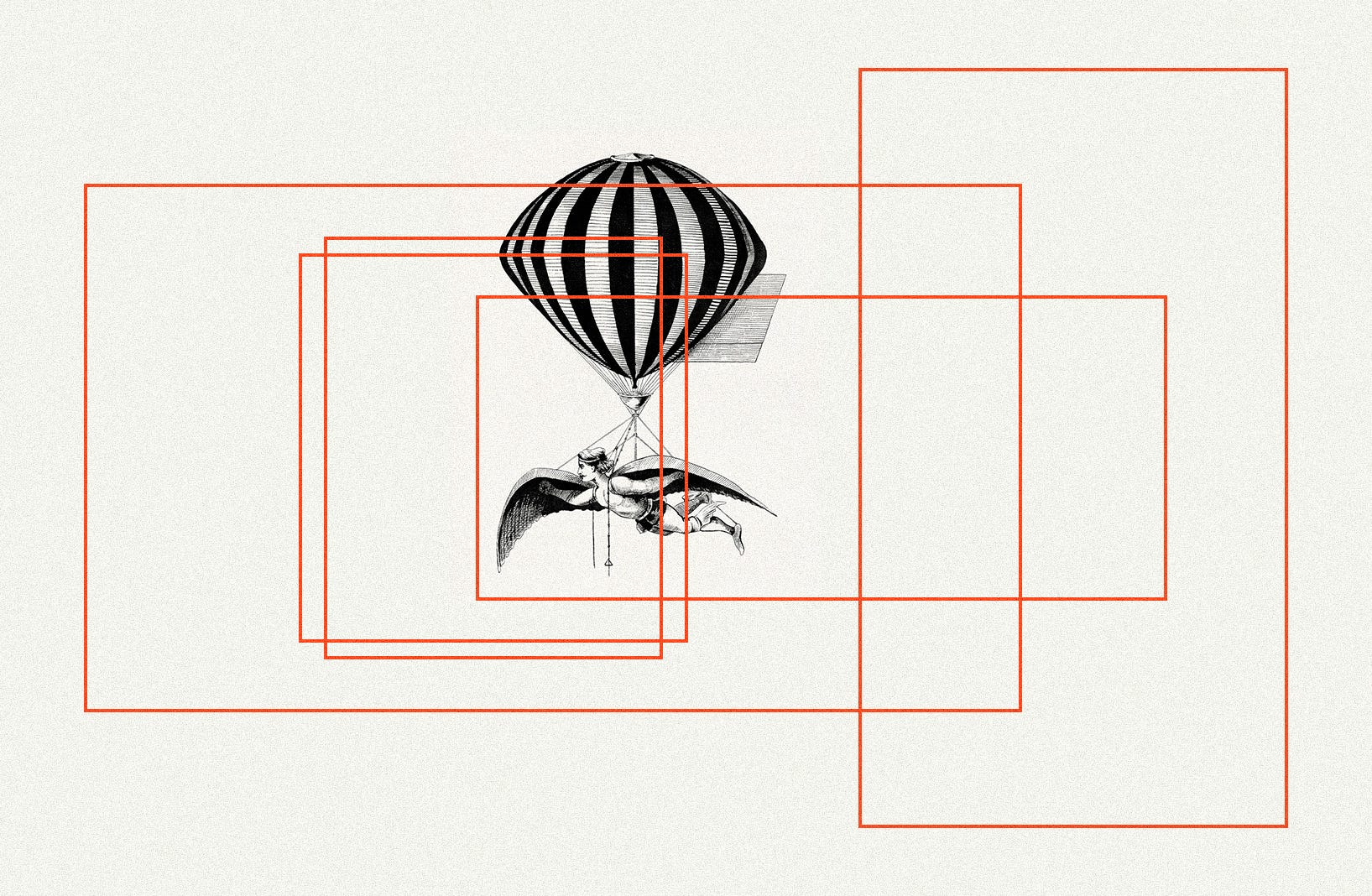
The lesson is to think about all the different materials you’ll need from the start. Discuss them with your designer and keep them in mind when giving feedback and choosing a concept. If a design for some reason relies heavily on its vertical format, you can expect problems down the road.
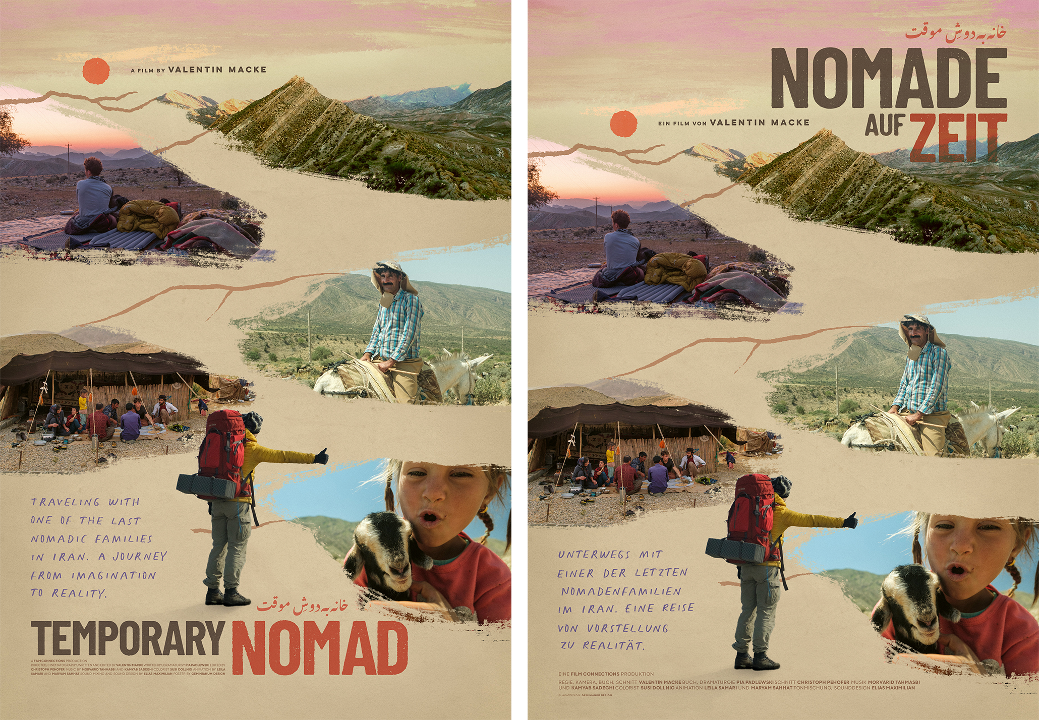
The same goes for language. If your title design relies on having certain letters, it might not translate well into another language. Even without custom lettering, a difference in the number of words or their length can sometimes create challenges.
Another thing worth planning for is festival laurels. It’s an element that often gets overlooked at first, but sooner or later filmmakers want to add them to the poster and various social media posts. The danger is overcrowding the composition. Laurels come in different shapes and sizes, and even if you limit their use to two or three most important festivals, balancing their visual weight can be tricky. I’ve seen too many great posters suddenly looking amateurish just because of a badly placed laurel.
And that not all: instead of getting the laurel in a proper vector file which can be resized and recoloured easily, they annoyingly often come as a low-resolution JPG with a white background.
My advice for this whole laurel business is to lean on the designer. Ask them to define positions and sizes in advance using generic laurel placeholders, or set aside a few extra hours of their time for later when the actual laurels arrive.
Conclusion + Inspiration
Standing out is more difficult than ever. Creating something truly great in any medium is always a bit of a lottery. There’s no formula you can simply repeat. But having a thoughtful approach to design can make the process smoother.
In trying to keep this article accessible, I had to simplify and generalize some aspects of the process. Reality is always more complex and less predictable (it’s also why each project is a new adventure!). Hopefully, these insights from my perspective as a designer will be useful in your future projects, helping you see graphic design as a tool with a wide spectrum of possibilities.
I’d like to end with a few links to websites that might inspire you in your own project.
Title design
danperri.com — Dan Perri is a legend of title design and this is a great overview of his work
Art of the Title — the definitive resource of title sequences with deep-dives, interviews, articles…
Posters
Posteritati — a movie poster gallery where you can buy original artwork or just browse for inspiration, filtering posters by genre, year, style, director…
Film on Paper — an archive of over 2000 film posters
IMP Awards — internet’s largest gallery for film and TV show posters
hanshillman.de — an archive of posters by Hans Hillmann, one of the best to do it
Movie Poster of the Week — a column by Adrian Curry, highlighting film posters from different periods, along with its much-anticipated annual list of the year’s best posters